
Multi Button
Some sections of your site support what’s called the multi button. Typically you’ll see this when editing a page’s hero section or flexible content.
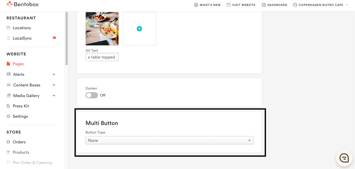
The multi button is adaptable and can display different types of content. Choose one of the following from the dropdown to enable.
URL: add a link, either to another page within your site or to an external website. After choosing “URL” from the button type dropdown, fill in the fields below.
Button Label: this is the text that will appear on your button.
Button URL: the link that your button will point to. This can be an internal page on your site or an external link. For internal links, we recommend using the truncated style. For example, if your link is to your menu page at http://www.copenhagenbistro.com/#menus, just enter /#menus in the URL field.
Button Opens New Window: check this box to have your link open in a new window. Recommended if you are using an external URL.
Button Uses Alt Colors: if your site’s template has an alternative color scheme set up for buttons, checking this box will enable this color scheme in this section. This is useful to ensure buttons are visible against light and dark backgrounds.
File: link a file that will be opened or downloaded when the visitor clicks the button. After choosing “File” from the button type dropdown, fill in the fields below.
Button Label: this is the text that will appear on your button.
Button Opens File: the file that your button will point to. This will usually be a PDF. Click the file icon to select a file to upload from your computer.
File Opens In New Window: check this box to have the file open in a new window when clicked. This is recommended.
Button Uses Alt Colors: if your site’s template has an alternative color scheme set up for buttons, checking this box will enable this color scheme in this section. This is useful to ensure buttons are visible against light and dark backgrounds.
Email Signup: clicking the button will pull up an email signup overlay so visitors can sign up for email updates. After choosing “Email Signup” from the dropdown, add the text you’d like to appear on the button in the button label field.
Reservations: clicking the button will send visitors to your reservations page. After choosing “Reservations” from the dropdown, add the text you’d like to appear on the button in the button label field. To use this feature, configure your reservations integration in integrations section.
Online Ordering: clicking the button will send visitors to your online ordering provider. After choosing “Online Ordering” from the dropdown, add the text you’d like to appear on the button in the button label field. To use this feature, configure your online ordering integration in the Integrations section.
Scroll Page: clicking the button will trigger the page to scroll down to the content below.